Symbols and Visual Language
also known as: Visual Design
Classification
- #method
- #medium/visual
- #roles/designer #roles/artists
- #used-by/designer #used-by/artist
- #tools/digital #tools/non-digital
Intent
- Visually communicate intentions to the player.
- Focus the player’s attention.
- Teach the player game mechanics.
Problem
- As a designer, you want to find a way to show the player which mechanics can be used and when (both in and outside of a tutorial level).
- How do you guide a player through a puzzle when certain mechanics are needed at specific points?
- How do you assist players who have difficulty navigating, climbing buildings, or adjusting to the difficulty level?
Solution Approach
- Utilize prefabricated assets as symbols that repeat throughout the level whenever a particular mechanic is required.
- Guide the player through the level with visual cues.
- Use symbols as a teaching method:
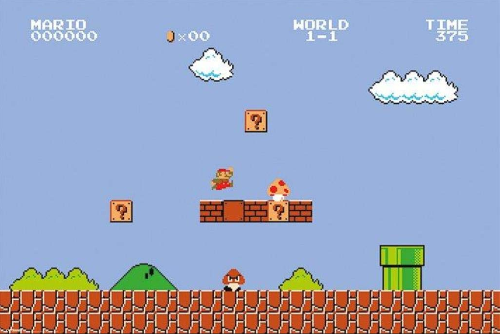
- Introduce them in tutorials and early levels, connecting them to specific mechanics (e.g., a question mark block in Mario signifies the ability to jump against it and receive a reward).
- Repeating these symbols reinforces the learning process.
Application
Input
- A map or level-in-progress (optional but beneficial).
- Fixed decisions on game mechanics.
Application
- Create environmental symbols that guide the player through the level, provide hints about certain mechanics, etc.
- Ensure each symbol has a unique appearance that distinguishes it from similar environmental elements.
- Repeat each symbol to help the player learn when and how to use them.
-
Introduce symbols used for teaching in the first levels or tutorial levels and repeat them to reinforce learning.
- Strategically place symbols and visual cues in later levels.
- Consider creating a schedule or Pacing Diagram exclusively for visual cues.
- Plan your level’s puzzles and labyrinths with these symbols and visual cues.
- Position them strategically.
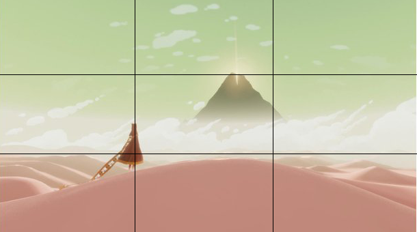
- Implement the “Rule of Thirds” by dividing the screen into three sections vertically and horizontally. Place elements along these lines to focus the player’s attention on key objects.
-
For example, “Journey”(2012) positions the player character on the first vertical line, covers the bottom third with a sand dune, and places the mountain (the game’s destination) in the center for a visually striking image.

-
- Collaborate with the artist team to create these assets.
- Ensure symbols are clearly distinguishable from other assets (e.g., consider making an interactable door 3D to stand out from the 2D background).
- Utilize basic color theory and high-contrast elements to make assets stand out.
- Employ the concept of framing, using surrounding elements to direct the player’s attention to important objects (e.g., trees framing a storytelling-important statue).
Output
- Symbols and visual cues as prefabricated assets for use in actual level construction, Asset.
- Possibly, a schedule indicating when to incorporate each asset/visual cue, Timeline.
When to Use It
- In the game development process during level design.
- After deciding on game mechanics.
- When considering level aesthetics.
Relevant Roles Using This Model
Relevance in the Following Processes
- Game Development Pre-Production and Production phases.
- Iterative Map Design when refining the map.
- Gamespace Prototyping, as it contributes to enforcing mechanics.
Applicability
- Finding a balance between providing too much and too little guidance to maintain the game’s challenge is essential.
Pros and Cons
Pros:
- Clear communication with the player.
- Reduces player frustration when they understand what to do.
- Simplifies wayfinding by using symbols as guides.
Cons:
- Symbols may blend with the environment if not distinguishable, leading to player frustration.
- Risk of overengineering by overwhelming the level with visual cues.
- Striking the right balance between assisting and challenging the player can be challenging.
Relation with Other Methods
- Mood Boards assist in finding the appropriate aesthetic and conveying intentions through visuals.
- Reference Collection can aid in selecting distinct shapes for symbols.
- Drawing a Map because cues are part of the map.
- Gym Scene: Test symbols with mechanics in a gym scene.
- Pacing Diagram or Reward Schedule can serve as a blueprint for planning the appearance of symbols and visual cues.
Examples
-
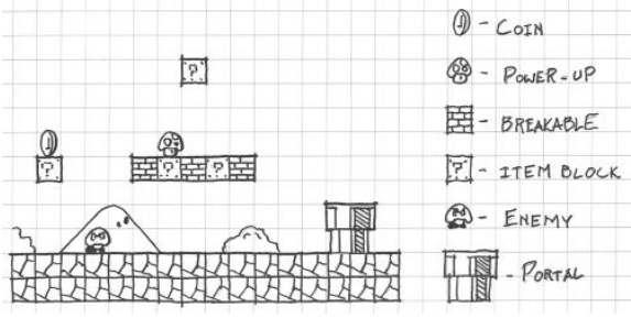
Mario Tutorial Level introduces symbols and visual cues that are repeated over the whole game
 (Source: Totten 2019 - An Architectural Approach of Level Design, p. 174)
 (Source: Super Mario Bros. 1985)
 -
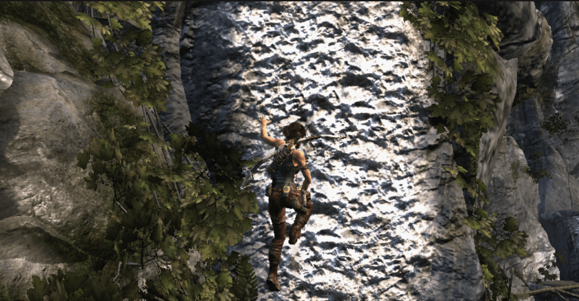
The climbable walls in Tomb Raider are introduced early in the game and somewhat distinguish themselves from other rocks
 (Source: Tomb Raider, 2011)
Relevant Tools
- Digital Art Tools
- Non-digital Design Tools
- Communication Tools
- Digital Collection Tools
- Game Engines
Relevant Literature
Totten 2019 - An Architectural Approach of Level Design p.169-184
Super Mario Bros., 1985
Tomb Raider, 2011
...